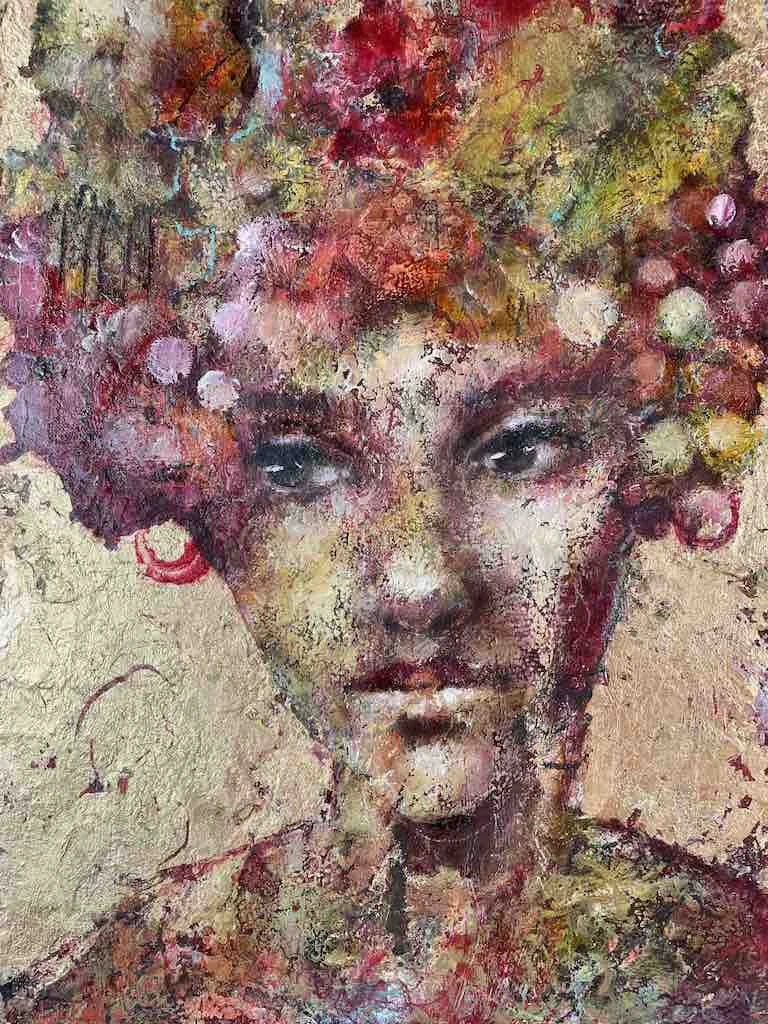
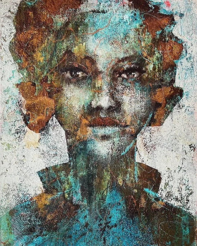
Opaque vs Transparent
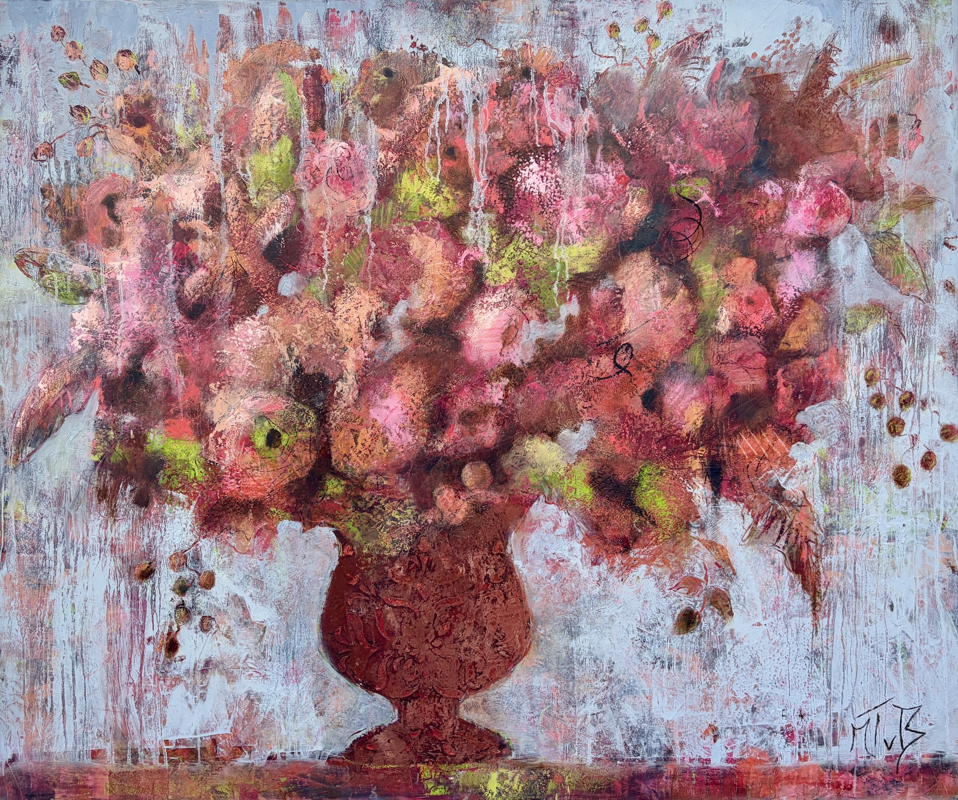
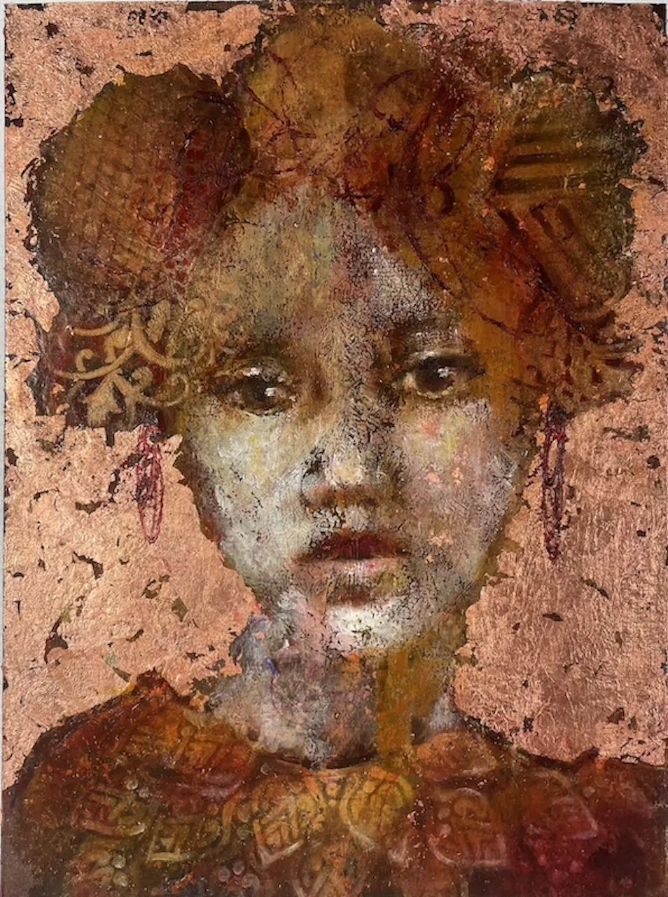
When it comes to working in oils or acrylics, understanding the transparency or opacity of your colors is super important! When you work in layers in painting with cold wax medium (oils and acrylics) it is important to know whether your paint color is TRANSPARENT or OPAQUE, WARM or COOL. In the video below, I'll show you how to recognise the transparency of your paints.
Color swatches
What you could do is make colour swatches in a sketchbook and write their properties (transparent, opaque, cool, warm) next to the swatch or you can simple mark a T or an O on your paint tube!
The transparent colours I can’t do without are:
Sennelier Chinese Orange
W&N Sap Green
Gamblin Asphaltum
Sennelier Alizarin Crimson
Gamblin Brown Pink
and of course
Gamblin Phthalo Turquoise💙
Hope that you liked the tutorial! If you haven’t subscribed to my channel, please do so to get notifications of future videos! 🔔
If you want to dive deeper into colour mixing, are frustrated that you colours turn into mud, don’t know what single pigments paints are, then the Colour Mixing Bootcamp is certainly something for you! In this bootcamp we explore the colour wheel, colour values, colour temperature and more. Check out the class below!
Yes, I want to be a colour Pro!
The Texture Lab
If you enjoy exploring texture and mixed media, you might also love The Texture Lab, my upcoming membership. It will be a place for creative experiments, lessons, and inspiration. Join the waitlist HERE